X

Getting a good night's sleep is associated with a more peaceful mind, that's why bedroom is where we spend the majority of our time when we get home following a long tiring day. As people remember the first impression colors provide them for a long time, it takes deliberate effort to set the mood that will allow them to sleep well. The impact of tones on one's emotional state is substantial. Making deliberate decisions about bedroom design is necessary in this regard.
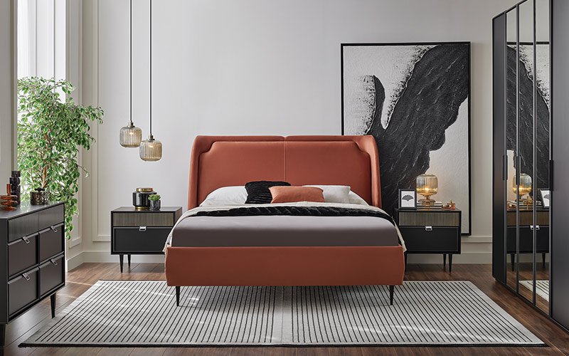
Since different tones lead the mind to diverse perceptions, the impact of colors on emotions has long been studied in psychology. In the bedroom, consumers tend to favor colors with a less exciting effect since, according to those seeking peace, a color palette that doesn't strain the eyes makes them feel more relaxed. According to color psychology, this color scheme has a calming effect on the room.
Particularly in cramped bedrooms, soft tone transitions can make a room seem more expansive. Colors that promote eye relaxation might hasten the process of falling asleep, as the brain's regenerative powers are amplified by relaxing stimuli. Thus, a far more soothing atmosphere is achieved when colors are chosen in accordance with the room's lighting balance.
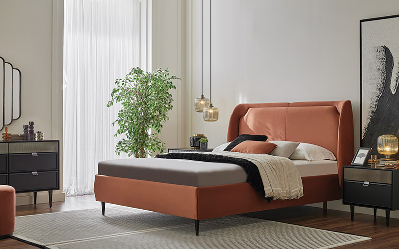
The impact of color choice extends beyond mere emotional processing; environmental cues play a significant role in the body's circadian rhythm as it transitions from day to night. For a better sleep, it's helpful to keep the eyes from being overly contrasted, since this encourages the body's natural production of chemicals that induce slumber. The resultant serene environment might also encourage consistent sleep patterns.
Softer tones have long been favored in bedrooms for their relaxing effects; after all, the ideal setting for the restful night's sleep is one that induces a state of mild doze. Many people choose to decorate their bedrooms with blue undertones because it is a calming color and helps put their minds at ease before bed. In terms of bedroom decoration, this method has the added benefit of making the airflow seem more expansive.
The soothing influence of green tones evokes images of nature, making any room seem more inviting. The room will make you feel more balanced and tranquil with the gentle green hues that help clear your mind. The calming effects of medium-green tones make them ideal for bedrooms and other areas where rest is imminent.
The mind is naturally drawn to clean surfaces, thus using shades of white creates a basic mood. Even if it's hard to see, the visual effect of light helps you relax before bed since it generates an organized image. In case you want to achieve a more harmonic appearance, try painting parts of the surface off-white or a gentle cream tone instead of a uniform bright white.
For a long time, people have acknowledged that blue has a calming influence on the psyche since it makes one feel like they are at the beach. People who work long hours often choose this tone for their walls or linens because it helps them unwind at the end of the day. Light blue tones are a good choice according to color psychology since they make people feel calmer.
Since the human eye perceives green as a neutral balancing factor, using shades of green can help bring a sense of nature indoors. More pastel options provide a sense of airiness, while medium-green tones establish a tranquil ambiance. These tones help preserve the integrity of the environment by promoting natural textures in accessory selection.
When going for a minimalist look, white, off-white, and cream tones are common choices since they give the impression that the room is clean. Soft whites are used in the headboard, textiles, and curtain elements to strengthen the environment's integrity. White tones, when adjusted correctly with the lighting of the room, does not provide an unpleasant level of brightness while switching to night mode and can actually improve the quality of sleep.
Color combinations with low contrast on various room surfaces are preferred by users who want to take more personal color applications. Color schemes that feature a variety of gentle tones create the impression of open space.
 Divanev is a Yatas Group brand


