X

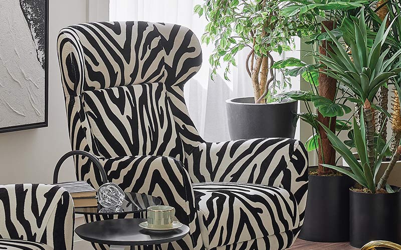
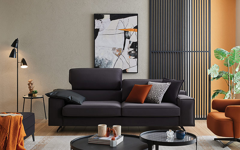
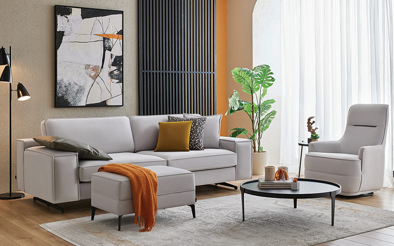
Color is more than just a cosmetic decision in today's homes; it has a direct impact on our mood, our pace of life, and how we perceive things. White and black, with their classic harmony, provide a striking visual language. Character is gained without sacrificing tranquility in spaces where basic lines are juxtaposed with deep contrasts. Living spaces are given a controlled dynamism by the approach as interpreted in the Divanev style. The intentional selection of colors has a profound impact on the ambiance that is immediately apparent when entering the room.
A breath of fresh air is provided by the room's white tones, while the depth is emphasized by the black embellishments. When the light is pointed in the right direction, the contrast between the walls and the furniture stands out more. When proportions are balanced, living spaces don't seem boring or tired. The rhythm of everyday living creates an ambiance that is both serene and awe-inspiring. Because of the improved visibility of the room's dimensions, the living spaces appear more structured.
When it comes to decoration, the psychological impact of colors is paramount. The use of white in a room, for instance, delivers the illusion of more light and space. By drawing attention to the room, black accents frame it. Combining these two colors creates the illusion of more structured living spaces. When used on a regular basis, a clean and uncomplicated arrangement is more pleasant.
The textures used enhance the overall effect. Matte surfaces diffuse light. The contrast is heightened by the glossy embellishments. The idea of modern home decoration is based on achieving equilibrium via the strategic use of elements like wood, metal, and glass. Having a range of textures makes a room feel cosier.
For the effect to last, sober decisions are crucial. Space provides enduring and pleasurable oneness when controlled transitions are favored over extreme contrast. Now is the moment when it gets easier to achieve a classic style.
It could appear daring to combine hues that are so different from one another. The end result provides a balanced structure when the proper proportions are met. When set against a predominantly white backdrop, black details become the focal point. A smooth flow is created when the eye wanders around the space. The user doesn't become tired from the sense of order that visual balance delivers.
The most obvious starting point for creating equilibrium is picking on a wall color. By using light colors, the room will seem more expansive. The use of dark details serves to draw the eye. The room seems more orderly when the furniture is placed with contrast in mind. A more solid feeling of spatial unity is achieved.
White surfaces show the effect of daylight, which helps to reduce contrast. Conversely, dark details are brought to light by artificial illumination. This equilibrium allows the space's conflicting colors to work together harmoniously. How the decoration is perceived is directly impacted by the use of lighting.
If you're going to use contrasting colors, you should not go overboard. With its understated design, each item makes a significant statement. This method lays the groundwork for a tranquil living environment. Simplifying the design makes it easier to use over time.
When complemented with various decorative elements, the combination of white and black amplifies its effect. You can give the room personality with accessories that keep the colors from clashing. Each item should be seen in context with the others. Choosing proportionally improves the overall ambiance.
Anyone seeking a white-and-black harmony can use the following suggestions as a starting point:
It is important to proceed with caution while putting these recommendations into action. It would be more effective to disperse the contrast according to the room's function rather than applying the same level of contrast everywhere. A bedroom may benefit from gentler transitions, while the living room may benefit from a more dramatic one. Prioritizing functionality is essential.
When picking out furnishings, linear shapes really pop. The impact of contrast is amplified when intricate details are avoided. This approach elevates the classic white and black color scheme to a whole new level. An easier way to express spaces is achieved.
The key to long-term enjoyment of this combination in living spaces is laying a modest foundation. The contrasting effect provides an elegant ambiance that isn't overpowering when the proportions are just perfect. On a daily basis, you can keep your equilibrium.
Designs by Divanev, which blend modern lines with traditional color balance, give living rooms a distinct personality. Aesthetics and practicality are given equal weight in its furniture collections, which showcase the harmonious combination of white and black. If you're looking to create an elegant yet understated ambiance in your home, Divanev has some great ideas.
 Divanev is a Yatas Group brand


